Virgin America
Reinventing the best in class airline booking
Virgin America website has truly reinvented an innovative and simple approach to help users book a flight. Since launched in 2007 and the ongoing efforts of site enhancements during the four years of client engagements, the website has evolved the industry's standards as the best in class airline website.


Background
Virgin America airline excelled a great reputation for an innovative, hip and easy to use airline website. The combination of a delightful customer experience, playful brand personality and tech-forward incentives are ways Virgin America redefined elegance in flying.
Challenge
To create an airline user experience from the ground up and make flying fun again with a functional booking experience.
Results
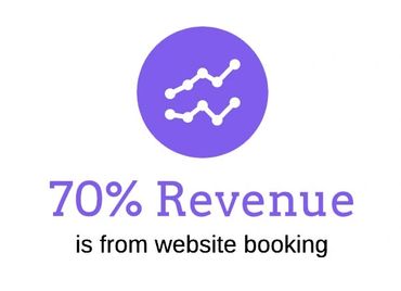
Virgin America's website reinvented how customers think about flying and booking tickets online. The design system successful supported the 4 years of client engagements as a universal library of brand-approved web assets and interactions used for ongoing site enhancements and product development sprints.
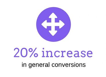
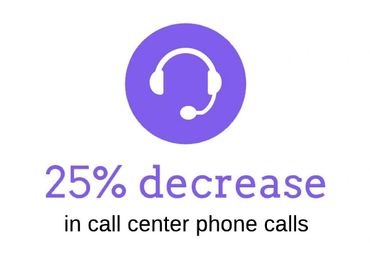
The user experience design stands proud against the traditional airline sites who started implementing a similar user-experience after launched in 2007. The end results effectively increased 20% in general conversions and 25% decreased in call center phone calls.
Awards
- The OMMA 2010 Awards Best Travel Website
- Best Airline Website by Zagat in 2009
- AdTech 2008 - Best B2CTransaction Website - Judges’ Award
- AdTech 2008 - Best B2C Transaction Website - People’s Choice Award
- OMMA Magazine - Best Travel Website
- Webby Awards 2008 - Official Honoree Travel Category
- Webby Awards 2008 - Official Honoree Best Visual Design - Function
- Summit International Award 2008 - Silver
Role: User Experience Director / Rokkan
Services:
• User research
• Business requirements
• Functional specifications
• Information architecture
• User flows and personas
• Wireframe and paper prototypes
• User testing
• Site templates and component library
• Booking funnel experience strategy
Platforms:
• Website 1.0 (2007) and 2.0 (2010)
• Booking funnel
• Loyalty program (2008)
• Community website (2009)
• Email strategy and templates
VA acquired by Alaska Airline in 2018Website sunsetted in 2019
